PixelGain image upscaler


The sheet moves; try it.
Role
UX Designer
Timeline
2 months
Deliverable
MVP
Tags
Consumer AI
Mobile web
IA
PixelGain is a web-based AI image upscaler, adapted to mobile from its beta-ready desktop version. Desktop tools like Topaz Gigapixel need an install and the user's own hardware; PixelGain runs the heavy AI on hosted compute, in the browser, so occasional users can upscale from any device, paying per inference in credits. I redesigned the three core mobile screens (file list, process settings, image attributes) to MVP-beta quality, with minimal UX changes and no room for a feature rebuild or a help doc. I leaned on familiar mobile patterns and made each screen self-documenting, so a newcomer could upscale an image and manage its versions unaided.
Decisions
D1
The nested list came from a wrong turn
The original-to-version link is the product's core mental model, inherited from desktop, but a fully nested list runs tall on a phone. I explored a filmstrip: good file overview, poor version handling, the hierarchy never read at a glance. A per-file detail list fixed the versions but cost a second screen. The version tree settles both: originals as rows, versions nested and collapsible, one compact vertical view. The wrong turn led right back to the desktop's nested structure, the relationship the redesign had to preserve.
The filmstrip, the detail list, and the version tree that settled it.
D2
Let the user set the split
On a phone, the image preview and the file list compete for the same vertical space. The list becomes a bottom sheet with three detents: a peek that keeps the preview full, a half height for quick version scanning, and full height for managing many files. The drag handle is a pattern people already know, so the trade between viewing and managing stays in the user's hands.

The same sheet at three heights, peek to full.
D3
A magic-wand button for the one action that matters
Processing is the whole point, but the old collapsed view hid it behind a swipe-up. A floating magic-wand button, the now-universal symbol for AI, keeps it one tap from the preview.

Process stays visible over the preview.
D4
Every control stays live
A version can't be reprocessed, so the old build greyed out the settings whenever you selected one, which read as broken. Because processing always runs on the original, every process tap routes back to the original's settings, so scale, noise, and face recovery stay adjustable and never dead-end on a greyed panel. The controls themselves move off the desktop's side rail into a focused sheet, the image's size and detected face up top to drive the choices and the credit cost carried under the button, so the price and the action sit together.

The desktop side rail.

Adapted as a sheet.
D5
I cut the attributes screen
"Self-documenting, no help doc" was the MVP bar, and image attributes were pencilled in as their own screen. I dropped it: each row carries its size, scale, and noise inline, so the file list reads as the attributes view, with no separate inspector and not one tooltip.
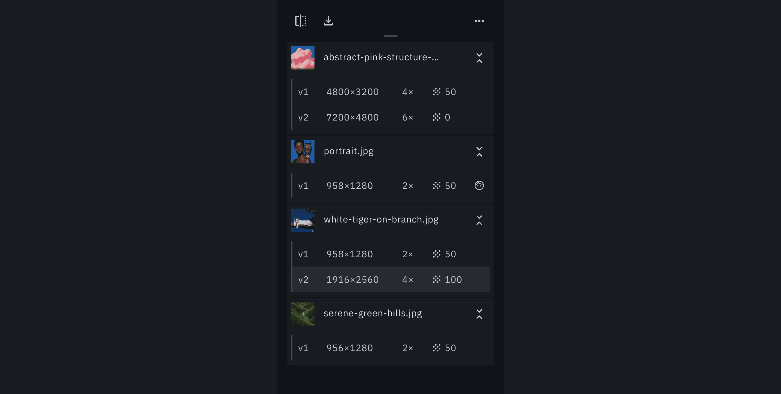
Size, scale and noise read straight off the row.
D6
Multi-select instead of swipe
Swipe-to-delete is doubly weak here: it's a hidden gesture a casual user may never find, and a row can expand to an original plus its versions, so even when found, a swipe never makes clear what it removes. I replaced it with an explicit Select mode (checkboxes plus bulk Download / Delete) where picking an original selects all its versions, matching the hierarchy.

Ticking an original selects its versions; actions sit below.
Results
Brought the three mobile flows to MVP-beta quality, and the version tree proved strong enough to carry back into a light desktop refresh, one structure across both platforms.