Paymonix dashboard
Role
Product designer
Timeline
8 months
Deliverable
Shipped product
Tags
B2B SaaS
Payments
IA
Paymonix is a payments and order-management platform for online merchants. I redesigned its information architecture and dashboard so marketing, customer service, logistics and leadership could each build the view they need: one reusable widget system plus a reworked payment-settings page. The hard part is that each metric's date-parameter logic has to survive being rearranged. I defined a widget anatomy and a metric/slot library to hold that logic; onboarding time halved and all four teams adopted the dashboard.
Decisions
D1
One reusable widget shell
The old dashboard was a fixed stack of charts under seven tabs, identical for every team. I designed a single widget anatomy (title, metric selector, date-parameter, date-range, value, visualisation) so any of 20+ metrics renders in any slot, and each role assembles the view it needs on its own.
Before: one fixed stack for every team.

After: a configurable grid of identical widget shells.
D2
The metric selector carries date-parameter logic
Choosing a metric isn't a filter. Each metric is bound to the date field that makes it true: created_at is "Orders Placed", paid_at is "Orders Paid". So Orders amount · Paid · Apr 1–30 changes what's being measured. The metric/slot library defines that coupling once and reuses it everywhere.

The three-part control sits on every widget.
Placed or Paid picks the timestamp the metric measures.
D3
Every widget's drill-in doubles as a filterable table
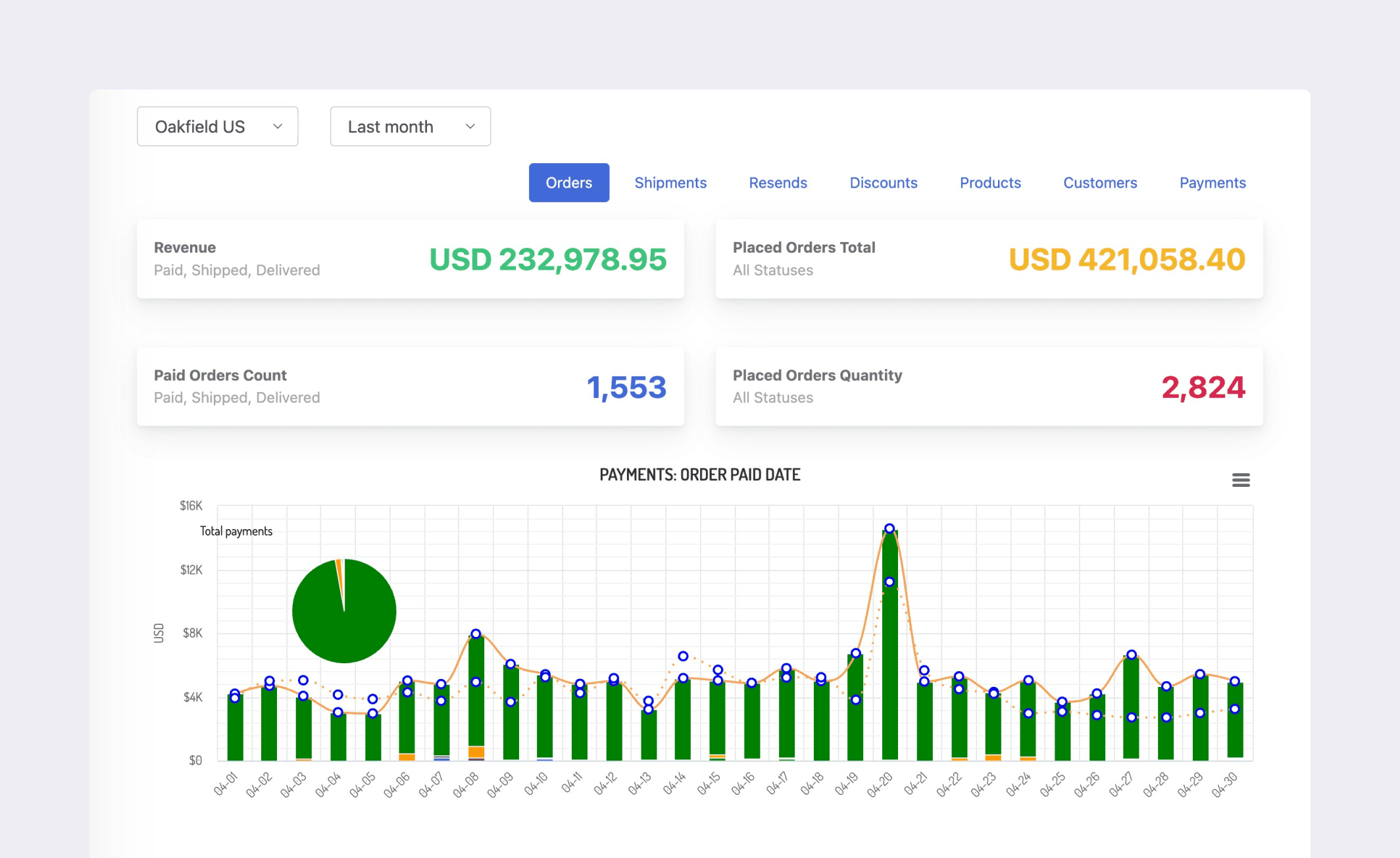
A line graph alone couldn't answer which days were outliers without hovering over every point, a complaint that came up in three separate feedback sessions. Clicking into a widget opens Date, Sales, Orders, and AOV columns, each with its own sort and min/max filter, still scoped to the metric and date-parameter the widget was already showing.

Orders amount, Paid, Apr 1–30: Mon 20 spikes.

Sorting and filtering Sales inside that scope.
D4
Selecting rows totals them, without losing the filter
Filtering narrows the table by rule, but the days worth totalling don't always share one. Checking rows totals Sales and Orders and recomputes AOV live in the footer, and previewing the full set pauses the filter, so the narrowed view is one tap back.
Four selected days roll into a running total, filters still on.
D5
Active in the system, hidden at checkout
A method can be enabled in the system yet hidden from shoppers, so the old single enabled/disabled badge missed the question operators actually ask: what does the customer see right now? I modelled status as two independent states, filterable by All / Active / Visible at checkout, with green dots for quick status and a checkout Preview that mirrors the live customer view.

Before: one enabled/disabled badge per method.
After: filter by Active or Visible at checkout.
D6
Quick edit for the row, Settings for the method
The old pencil opened one long form, order and min/max buried among secret keys, fraud alerts, and rotation rules, so a quick reorder meant scrolling everything. Two client accounts flagged the edit control as confusing. I split it: quick edit handles the fields already visible in the row (order, min-max, location); Settings keeps the deeper configuration.

Before: reordering a method meant opening its whole configuration.
After: the row's fields edit inline; Settings keeps the rest.
Results
As reported by the client: 50% faster onboarding (48h to 24h), up to 80% less time spent gathering and reading reports, 100% adoption across marketing, customer service, logistics and leadership, and +85% sales recovery, around $60K a month in added revenue.